In the previous blog post I introduced the surprise gender neutral nursery project and how [spoiler] the whole room would be drenched in blue. Today, we’re diving into the details of how this will work.
Here’s a professional tip—the key to pulling off this blue room and selling it as potentially a girl’s room is going to be carefully curating and balancing masculine and feminine elements in the room. **Another tip—you may desire a professional to help you pull this off (that’s me!). Not me plugging my own services in my own blog post! But seriously, I’m here to help.
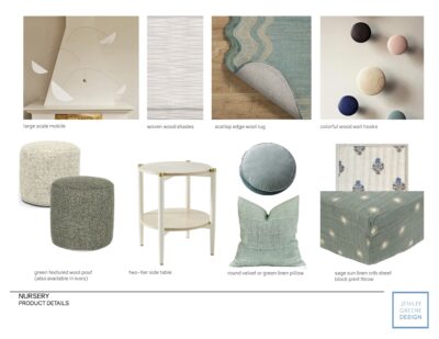
Ok, back to the blue nursery. In this case, to offset the more masculine color palette, I will incorporate feminine patterns and silhouettes through carefully curated furniture, accessory, and textile selections. Think scalloped edges in the rug, a floral block printed throw, a fluted detail on the dresser, bouclé upholstery, gold accents on the furniture and accessories. So, for example to soften the potential “masculinity” of the blue color of the rug, the scalloped edges lend a more feminine feel. Together, those opposing characteristics combine in a neutral way. Now that I was married to this rug, it was time to select a final paint color based on our inspiration image but that would not totally clash with the rug. After a couple rounds of sampling, we landed on Benjamin Moore’s Buxton Blue and I cannot wait to see it cover every surface!
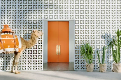
Let’s talk about a key feature in the room besides color for a second. One of the only requests from the client was to incorporate a Gray Malin art piece into the design. I was very supportive of this and knew the colorful, whimsical nature of his photography would really lend itself to a nursery and I wanted to feature it front and center on the crib wall (another reason we HAD to find a layout that could have the crib centered). We selected this one because a) it’s cute, b) the “H” of the Hermes blanket is a bit of a double entendre since it’s also the initial of their last name which is a fun touch and c) orange is a complementary color to blue so it would provide a great accent within the blue color palette.
I will be using my go-to online framing company Framebridge (not sponsored, but probably should be lol), using a simple white gallery frame and white mat so the photograph pops on that blue wall.
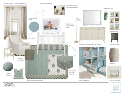
As for the remaining elements—a few million hours of sourcing, tweaking, drawing and 3D modeling later, the design came together like “magic”. Here is the final design board: I love it. I’m obsessed with all of it. The mirror? The dresser? The lamp? I love lamp. I would live here (and that’s the test). Next time you hear from me, there will ideally be some progress to show!


