Hi! Wow it’s been a minute since I wrote a blog post. I’ll admit, I have a love/hate relationship with writing (in general) and couple that with a lack of time and I have excuses for days. Having said that, I really would like to post more regularly and I what better way than to introduce this special project!
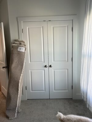
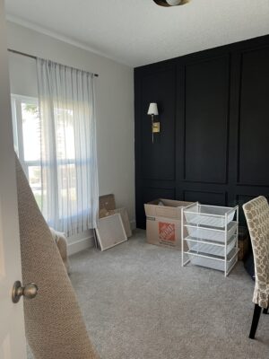
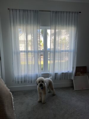
I was recently asked to design a nursery where my client actually requested a…. SURPRISE REVEAL! The client in this case was my sister-in-law, so there was above-average trust already built in, but still, I appreciate her relaxed energy and know it will be a lot of fun. Here’s the room we’re working with:
The trickiest part of the whole assignment is the baby’s gender is ALSO a surprise, so the nursery design needs to be gender neutral. Now, if you’ve ever tried to design a gender-neutral room where the occupant’s gender is fully UNKNOWN, then you know this is actually a pretty challenging task when your goal is to create an exciting and dynamic space. How do you push boundaries with all this uncertainty?
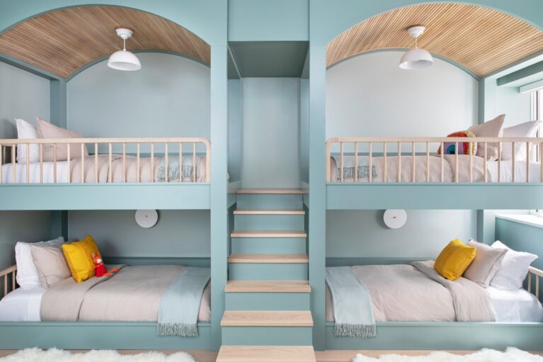
I am going to tackle this concern head on by making a potentially [very] controversial move and color drenching the room in blue. Yep, it’s blue for me, immediately blue. See what I did there? Just went straight for the opposite of the expected. I guess I’m feeling pretty rebellious and kind of dangerous.
Even as I’m deciding on this blue direction, I can already hear the naysayers naysaying that it’s totally unhinged to select blue for a gender-neutral space because of the whole “blue is for boys, pink is for girls” thing, but TBH I really do not want yellow or grey or anything else that has traditionally been deemed acceptable gender-neutral colors. I am currently feeling very inspired by blue rooms, and it sort of just happened. Specifically, I couldn’t stop thinking about this particular shade of blue!. I feel confident I can work with this hue in a gender-neutral space.
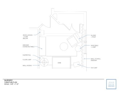
With free rein over the design, I was able to cut out the typical back-and-forth with the client on the conceptual phase and have already begun developing the design. The first order of business, after concept design, is to create a space plan. In this case, we will need to squeeze a crib, changing table and rocker or glider into a somewhat small footprint. Further adding to the challenge is a [too] low, off-center window and some existing picture molding which I would like to try and embrace in the new design. So, are left with 2.5 usable walls.
It’s a funny thing about space planning with cribs. They are small and want to be centered on the wall, but this can be tricky since the rockers typically also found in nurseries can take up a quite a lot of space (especially the reclining variety that have become very popular!). In this case, the crib HAS to be centered on the focal wall due to the symmetry of the existing picture molding and my vision for the space. After many iterations (with myself, haha), this layout was the winner and, in my opinion, creates the perfect balance of design and function. Wall-to-wall drapery will be the ideal solution for disguising the awkward window placement and bonus—added softness, quietness, luxury and some drama which is [almost] always a good thing.
Now with the general layout set, it’s on to furniture and paint selections!

