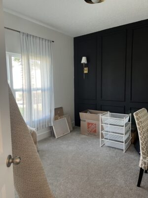
Let’s check in on our Blue Nursery Project shall we?? We have exciting progress to report, like visible, tangible progress which is the best kind.
Here’s a reminder of how it started. If you missed it, you can catch up here (backlink to blog post!!):
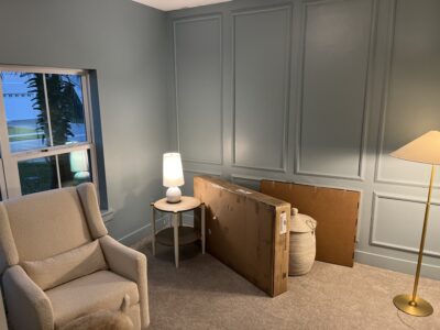
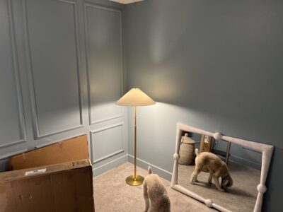
So far, the painting is complete and the furniture, rug, window treatments and accessories have been ordered! Never underestimate the power of a carefully selected paint color. The decision to paint everything (baseboards, doors, etc.) is really working for me and makes for an impactful transformation. It also gives a more modern feel which was needed since I had some concerns that the existing picture moldings would lean too traditional for my liking. Painting everything one color mitigates that concern.
You can see several furniture, lighting and accessory pieces have already arrived, so we’re getting there! Notice how helpful and attentive the dog, George, has been throughout this process.
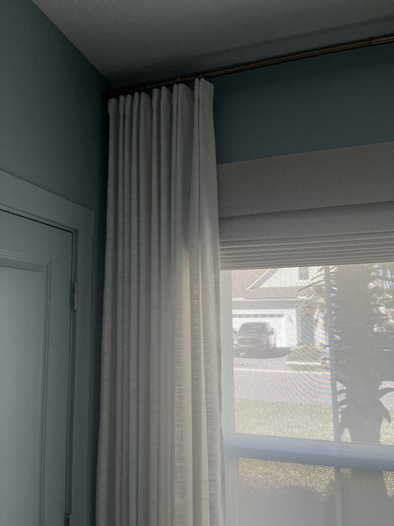
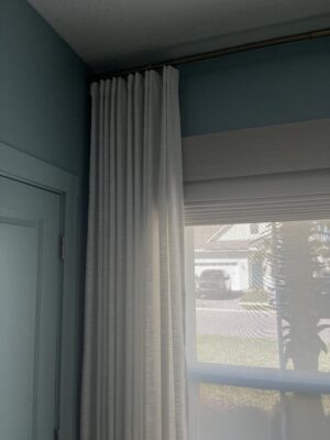
Another big step was getting the window treatments installed. Since this is a nursery, and babies are very demanding, I wanted to deliver maximum light control which meant taking a layered approach.
Layer 1 is a solar shade which cuts the glare during the day but does not deliver enough privacy at night.
Layer 2 is a woven wood Roman shade with blackout lining for daytime naps and nighttime privacy (and great texture from a design standpoint).
Layer 3 are the custom draperies which are purely aesthetic although they do mitigate some of the inevitable “light leak” around the edges of the blackout Roman shade.
 The shades are motorized so the daylight in the room can be controlled in seconds with the touch of a wall-mounted button! I looove the ease of the motorization and how it elevates and streamlines a repetitive touchpoint like opening and closing multiple shades multiple times per day.
Also of note, remember the off-center location of the window that was resolved with creatively placed? What about the fact that the window seemed not tall enough for the room? This was corrected visually by designing the Roman Shade in a longer length and mounting to the exterior of the window to give the appearance of a taller window. This trick works every time! This is my standard preference even when the window isn’t “too short”, just because I prefer to maximize the light coming in through the window and I don’t want to lose 12” of glass to the stacking of the shade.
Anywayyy, cannot wait for installation of furniture, rugs and accessories! Coming soon…

