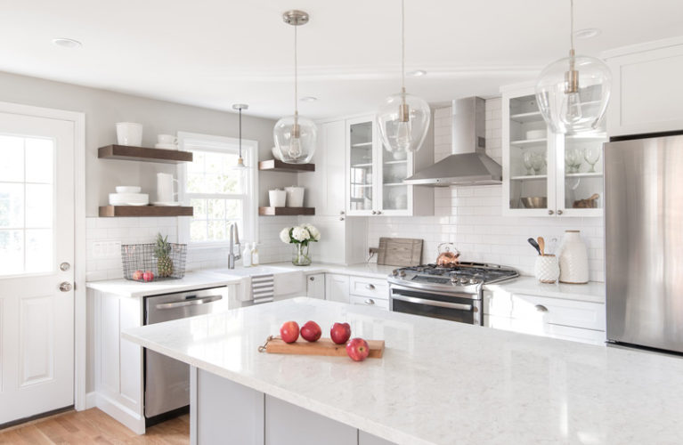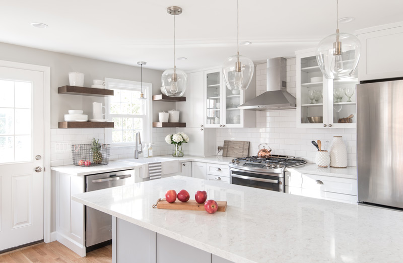
I know everyone’s been on the edge of their seats waiting for part 2 of this blog post, and it’s finally happening! In Part 1 of this blog post, 4 rough layout options were presented to the client. After discussing the logistics with a contractor, they agreed it would be a worthwhile investment to open up the floor plan and demolish the wall between the living room and existing kitchen to create the open concept layout! This required adding a support beam, but was totally worth it.
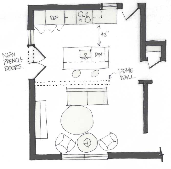
This was easily the best option because it gave our clients everything on their wish list—the island, more seating, unrestricted sightlines for supervising the kids, and just a very functional, modern layout that would also enhance resale value if the time came to sell.
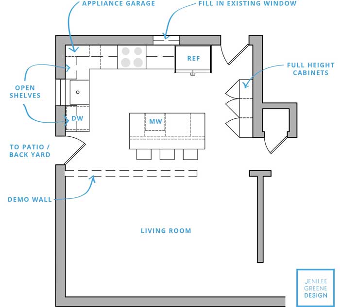
With the general plan now in place, we further developed and refined the layout and cabinetry design to maximize storage. The main changes were adding a bank of full height cabinets and removing an exterior window (that didn’t have a particularly good view). Additionally, we kept the single exterior door (as opposed to adding French doors) to the outside deck and created an L-shaped perimeter with the cabinetry, establishing symmetry on the back wall with the range to create a strong focal point. Here is the final floor plan….
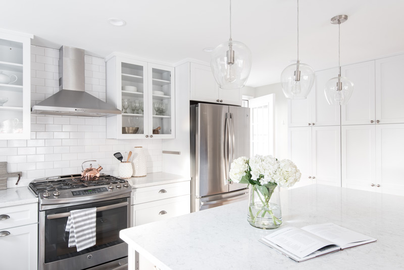
The new kitchen space was further enhanced with a completely reimagined, layered lighting plan that included recessed lights, undercabinet lighting, and decorative pendants. Goodbye forever harsh overhead lighting and curly, exposed CFL light bulbs! Visit Part 1 for the before pictures.
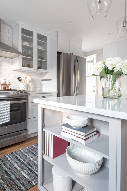
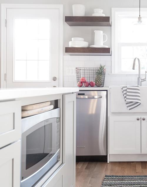
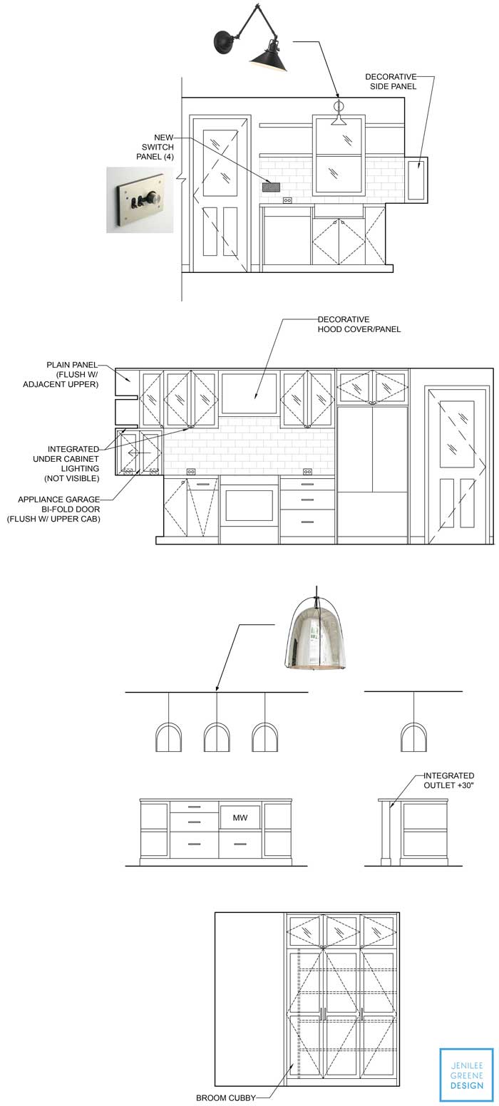
Electrical placement was carefully designed, the microwave was integrated into the island, and countertop appliances were tucked away in an appliance garage to alleviate countertop clutter. Here are the final drawings…
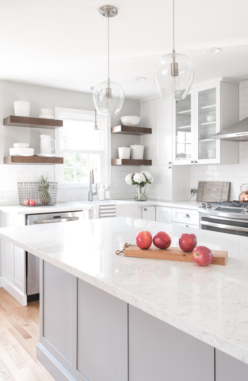
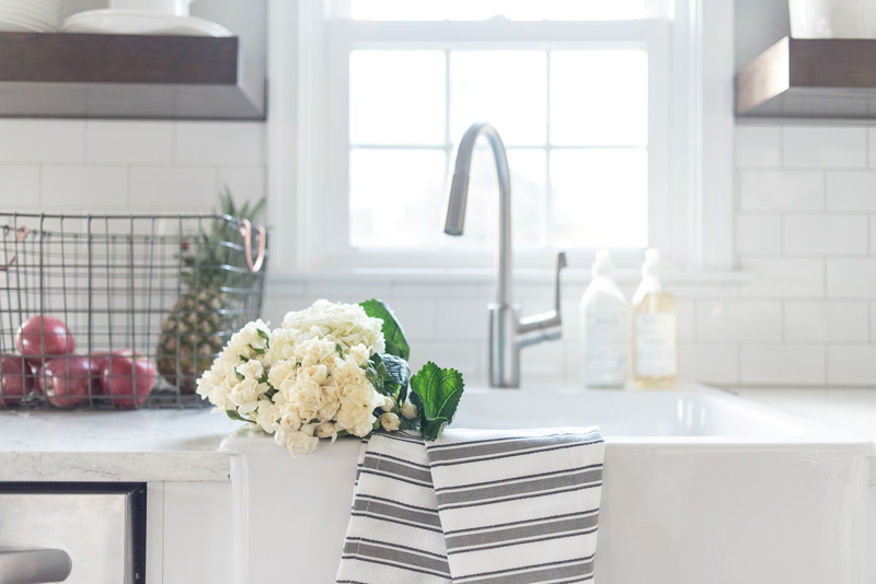
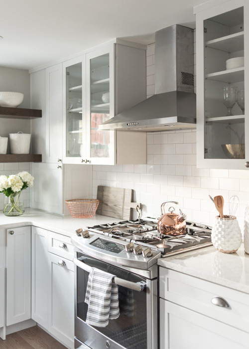
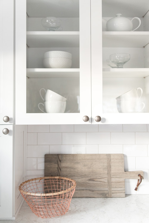
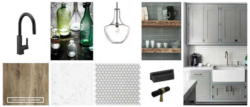
While we were not engaged to select final finishes or lighting, we assisted with an overall high-level design concept and the client was able to take these ideas to help guide and inform the many decisions that needed to be made. We balanced the requested traditional elements like shaker style cabinets, a farmhouse sink, and wood floors to match the original floors with a neutral color palette and transitional light fixtures to keep things fresh and modern.
Open shelving replaces bulky upper cabinets on the sink elevation, creating a visual break and a display opportunity for little-used sculptural kitchenware as well as frequently used everyday items.
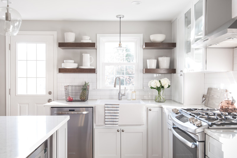
Aside from the initial site visit (which was done while we were still living in DC), this project was executed remotely through email, phone calls and Facetime! This project was so much more than a kitchen– it was a total transformation of day-to-day lifestyle, and we are absolutely thrilled with the result. We love seeing our amazing clients (and friends) enjoying and entertaining in this fresh, bright, and open space. Scroll down for the rest of the final images!
If you are interested in learning more about e-design, check out our services page or email Jenilee at [email protected].
